4. Introduction to Matplotlib
Matplotlib is a module that is used for ploting data. Take a look at the Matplotlib gallery to see all the plots you can make with matplotlib given enough time.
Here we’ll cover two of the most commonly used functions of matplotlib; making scatterplots and displaying images.
We import matplotlib as follows:
>>> import matplotlib.pyplot as plt
4.1. Plotting data
As an example dataset, we’ll look at the relationship between tree diameter (DBH) and tree height from some measurements in miombo woodland in Tanzania. Allometric relationships similar to this are central to estimating the biomass in forest plots.
The data we’ll use is named treeData.csv.
First, we’ll load the data into Python:
>>> import numpy as np # Make sure numpy is loaded

>>> tree_data = np.loadtxt('treeData.csv',skiprows=1,delimiter=',') # Load in data.

>>> tree_data
array([[ 37.6 ,  11.5 ],
       [ 20.1 ,   7.5 ],
       [ 32.5 ,  10.5 ],
       [ .... ,  .... ],
       [ 54.5 ,  12.75],
       [ 11.9 ,   6.25],
       [ 11.5 ,   5.75]])
The first column of this dataset contains estimates of tree DBH (units = cm), and the second column contains estimates of tree height (units = m). At the moment the data have been loaded as a single 2 dimensional array. We can separate it into two arrays as follows:
>>> DBH = tree_data[:,0] # Index every row and the first column

>>> DBH
array([ 37.6,  20.1,  32.5,  47.4,  37.9,  38.8,  41.1,  22.9,  24.1,
        40.2,  36.9,  32.7,  38.9,  27.6,  39.6,  30.1,  77.3,  35.7,
        36.8,  71. ,  62. ,  50.4,  65.7,  16.8,  61.4,  17.9,  19.8,
        20.1,  17.1,  13.3,  25.8,  34.4,  29.4,  25.8,  13.8,  13.4,
        34.5,  57.5,  23.2,  21. ,  71.1,  49.5,  21.4,  25.5,  47. ,
        10.7,  21.9,  19.7,  18.8,  42.9,  65.3,  18.4,  19. ,  50.6,
        51.5,  43.3,  28. ,  19. ,  15.9,  39.3,  41.1,  38.1,  13.9,
        10.3,  10.2,   9.7,  16.6,  28.8,  11.7,  16.6,  15.1,  39.8,
        25.9,  46.3,  27.1,  52.4,  49.7,  36.2,  26.1,  25. ,  21.4,
        20.1,  29.9,  23.1,  74. ,  62.1,  46.2,  16.8,  23.4,  20.4,
        64.4,  33.6,  59.2,  32. ,  18.5,  15.8,  13.8,  15.8,  42.7,
        24.1,  16.5,  10.8,  11.3,  57.2,  47.7,  27.7,  21.2,  17.5,
        13.3,  11.9,  31.2,  28.2,  34. ,  43.4,  31.7,  24. ,  18.3,
        27. ,  23. ,  33.8,  46.4,  19. ,  18. ,  40. ,  27.9,  13.8,
        19. ,  19.2,  17.8,  12.9,  35.9,  18.2,  56. ,  22. ,  30.9,
        25.4,  41.8,  14.2,  53.7,  28.8,  34.9,  26.7,  45.1,  12.1,
        26. ,  10.8,  16.2,  13.1,  27.2,  25.9,  48.1,  25.5,  48.2,
        52.8,  32.3,  40.2,  32. ,  24.1,  13.5,  37.5,  20.8,  42. ,
        20.6,  16.6,  20. ,  20.3,  21.1,  18.8,  17.1,  16.9,  20.3,
        15.4,  48.8,  39.5,  49.7,  54.3,  59.4,  12.5,  31.9,  37.1,
        16.5,  68. ,  14.4,  43.9,  26.6,  27.9,  72.5,  33.8,  53.2,
        27.2,  30.7,  49.4,  10.1,  38.1,  29.2,  10.7,  20.2,  23.9,
        29.1,  25.3,  26.2,  51.5,  51.4,  14. ,  12.9,  14.7,  33.3,
        67.5,  26.7,  20.3,  27.1,  17.4,  15.9,  15. ,  17.5,  37. ,
        13.7,   8.4,  10.5,  11.5,  13.2,  13.7,   8.9,  11.7,  10.9,
        67.1,  71.8,  35.1,  35. ,  17. ,  21.1,  29.7,  18.1,  14. ,
        33.2,  56.7,  13.4,  13. ,  14.2,  51. ,  29.6,  35.2,  22.1,
        50.5,  41.9,  39.6,  31. ,  46.1,  42.9,  45.9,  28.9,  40.3,
        39.1,  48. ,  15.1,  13.3,  13.4,  16. ,  12.4,  42.7,  57.7,
        21.4,  25.2,  51.7,  57.3,  23.2,  32.7,  15. ,  43.7,  54.5,
        11.9,  11.5])

>>> height = tree_data[:,1] # Index every row and the second column
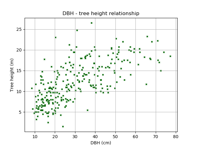
Next, we’ll build a scatter plot to show the relationship between DBH and tree height using matplotlib:
>>> plt.scatter(DBH, height) # Build scatter plot
<matplotlib.collections.PathCollection at 0x30fdd50>

>>> plt.show()
There’s a lot we can do to improve this diagram, such as using different colours and markers, and adding labels.
>>> plt.scatter(DBH, height, c='darkgreen', marker='x', s=10) # Try other colours [c], sizes [s], and marker [marker] types!
<matplotlib.collections.PathCollection at 0x3123450>

>>> plt.xlabel('DBH (cm)') # Set x-axis label
<matplotlib.text.Text at 0x3112890>

>>> plt.ylabel('Tree height (m)') # Set y-axis label
<matplotlib.text.Text at 0x30997d0>

>>> plt.title('DBH - tree height relationship') # Set title
<matplotlib.text.Text at 0x312fd90>

>>> plt.grid() # Add a grid

>>> plt.show()
We can also add the linear line of best fit. First determine the slope and intercept of the best fit line:
>>> par = np.polyfit(DBH, height, 1, full=True)

>>> slope=par[0][0]

>>> intercept=par[0][1]
Then plot:
>>> plt.scatter(DBH, height, c='darkgreen', marker='x', s=10)
<matplotlib.collections.PathCollection at 0x5c21ed0>

>>> plt.xlabel('DBH (cm)') # Set x-axis label
<matplotlib.text.Text at 0x5c4eed0>

>>> plt.ylabel('Tree height (m)') # Set y-axis label
<matplotlib.text.Text at 0x5c1b8d0>

>>> plt.title('DBH - tree height relationship')
<matplotlib.text.Text at 0x5c14b50>

>>> plt.grid()

>>> x = np.arange(0,81,1)

>>> y = x * slope + intercept # y = mx + c

>>> plt.plot(x,y,'k') # 'k' for black
[<matplotlib.lines.Line2D at 0x5c28610>]

>>> plt.xlim(0,80) # Set x-axis limit
(0, 80)

>>> plt.ylim(0,30) # Set y-axis limit
(0, 30)

>>> plt.show()
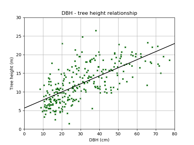
How useful do you think this relationship is? Should we really have used a straight line?
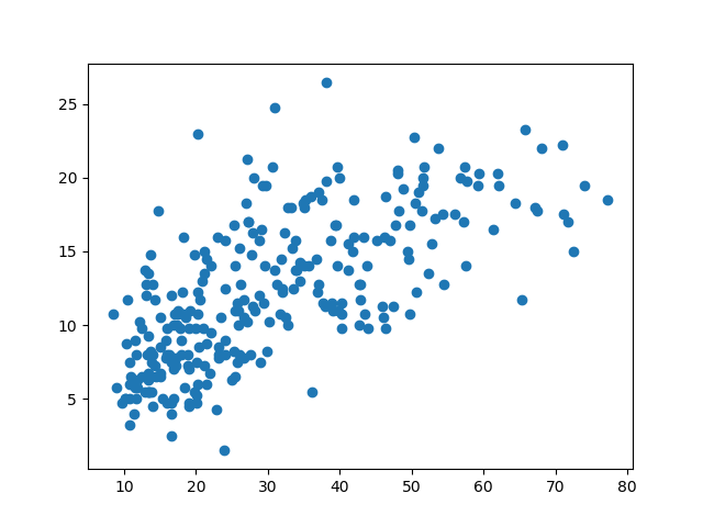
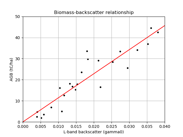
4.1.1. Exercise: Building a biomass-backscatter relationship
L-band radar backscatter shows a strong response to variation in aboveground biomass (AGB), a property which can be used to map forest biomass. Here we’re going to generate a linear biomass-backscatter relationship using data from Tanzania.
The data can be found in `biomassBackscatter.csv`_, the first column is radar backscatter (s0) and the second column is AGB (tC/ha).
Plot the relationship between biomass and l-band radar backscatter. Include:
- A point for each data point
- A line showing the linear relationship between the biomass and backscatter
- Axis labels and a title
You should aim to create a plot that looks something like this:
4.2. Displaying images
As an example dataset, we’ll look at a Digital Elevation Model (DEM) of Mozambique from the Shuttle Radar Topography Mission.
This data is available for downloaded as a GeoTiff file named MozambiqueDEM.tif.
First, we’ll load the data into Python using the Geospatial Data Abstraction Library (GDAL) module. GDAL provides an extremely useful set of tools to process geospatial imagery. We’ll cover GDAL in more detail in the next section..
Warning
GDAL is notoriously difficult to set up. If you are getting errors, download MozambiqueDEM.npy and use the following line to load the DEM instead:
DEM = np.load('MozambiqueDEM.npy')
>>> import gdal # Or from osgeo import gdal

>>> ds = gdal.Open('MozambiqueDEM.tif') # Open the geotiff file

>>> DEM = ds.ReadAsArray() # Read the data into a numpy array

>>> DEM # The units of this data are metres
array([[1476, 1480, 1474, ...,    0,    0,    0],
       [1490, 1491, 1479, ...,    0,    0,    0],
       [1500, 1501, 1494, ...,    0,    0,    0],
       ...,
       [1669, 1701, 1768, ...,    0,    0,    0],
       [1660, 1686, 1732, ...,    0,    0,    0],
       [1661, 1695, 1791, ...,    0,    0,    0]], dtype=int16)
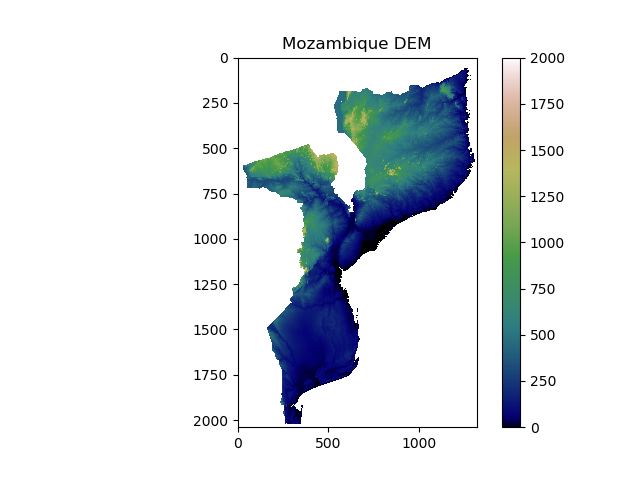
We can display the DEM as an image using matplotlib:
>>> plt.imshow(DEM) # Plot image

>>> plt.show() # Show image
You should see something that looks like this:
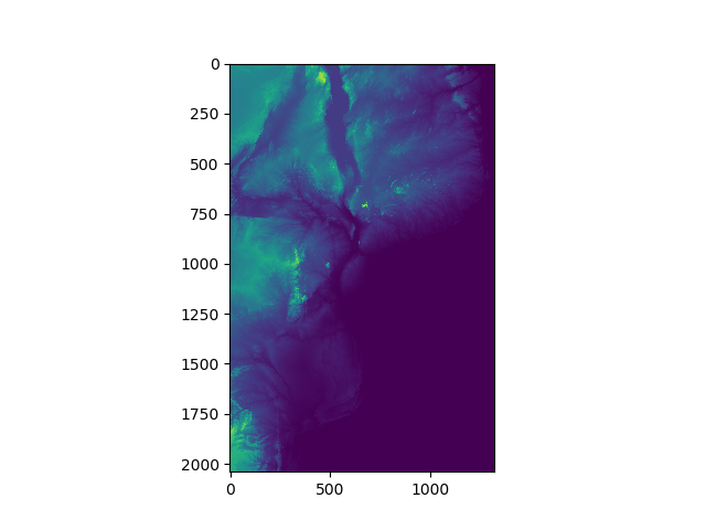
In this image you should be able to make out the coastline of Mozambique, as well as locations of major lakes and mountains. However, we can do a lot to improve this image with the options provided by matplotlib.
We’ll apply a better colour map to the image, specify limits on the color map, show a colour bar to aid interpretation, and add a title. Matplotlib comes with a range of colourmaps built-in. Pick a colourmap you like, and apply as follows:
>>> plt.imshow(DEM, cmap = 'gist_earth', vmin = 0, vmax = 2000) # Choose color map, and limits

>>> plt.colorbar() # Adds a colour bar to the image

>>> plt.title('Mozambique DEM') # Adds a title

>>> plt.show()
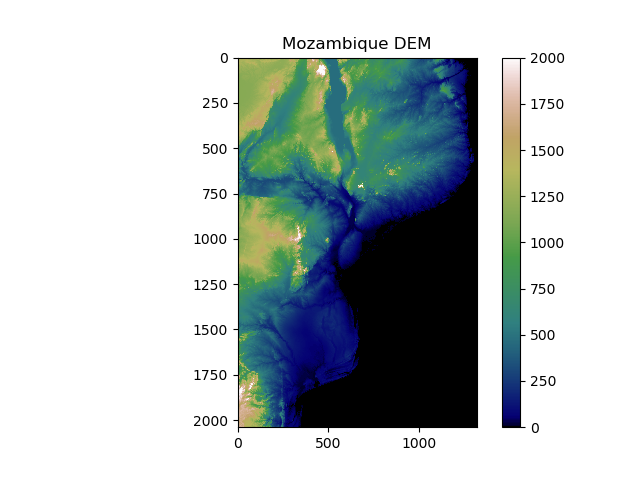
Make sure you understand all the options we specified there. Try out your own colour maps and limits!
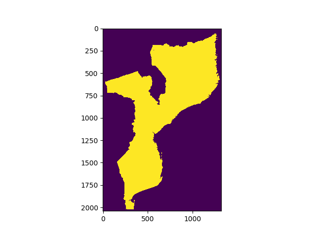
4.2.1. Adding masks
Usually we are interested only in one area of interest. In this case, we might want to mask out anything outside of Mozambique.
First load and display MozambiqueMask.tif (or MozambiqueMask.npy), which indicates which pixels fall within Mozambique. You can follow the same procedure as we used to load the DEM.
You should end up with someting that looks a bit like this:
We’ll create a masked array from the DEM, that excludes anything outside of the mask:
>>> DEM_mask = np.ma.array(DEM, mask = Mozambique_mask)

>>> DEM_mask
masked_array(data =
   [[-- -- -- ..., -- -- --]
    [-- -- -- ..., -- -- --]
    [-- -- -- ..., -- -- --]
    ...,
    [-- -- -- ..., -- -- --]
    [-- -- -- ..., -- -- --]
    [-- -- -- ..., -- -- --]],
         mask =
   [[ True  True  True ...,  True  True  True]
    [ True  True  True ...,  True  True  True]
    [ True  True  True ...,  True  True  True]
    ...,
    [ True  True  True ...,  True  True  True]
    [ True  True  True ...,  True  True  True]
    [ True  True  True ...,  True  True  True]],
          fill_value = 999999)
When you plot your new masked array, does it look like this? If not, can you fix it?
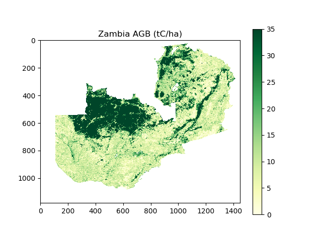
4.2.2. Exercise: Your turn
I’ve provided you with some data from the Avitabile pan-tropical biomass map, covering the area of Zambia. The data are in two files, just like the Mozambique DEM example.
- AGBZambia.tif (or AGBZambia.npy)
- Data have units of tonnes of carbon per hectate (tC/ha)
- Data have an equal area projection, with each pixel representing 1 km2
- No data is indicated by a value of -3.39999999999999996e+38
- ZambiaMask.tif (or ZambiaMask.npy)
- 1 where pixel falls inside Zambia, 0 where pixel falls outside Zambia
With this data, address the following tasks:
- Load in the data to python, and create a masked array of Zambia’s AGB
- Visualise the data (see below for an example)
- Calculate Zambia’s total AGB stocks according to the Avitabile biomass map. Take care with units and no data values!